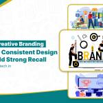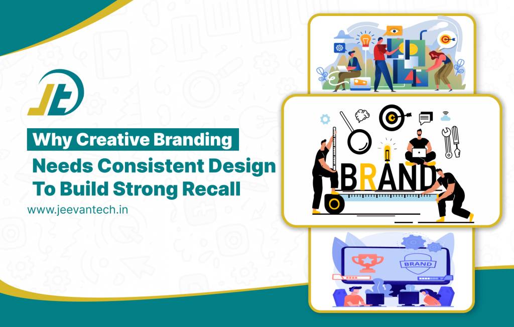
Introduction
Consider a perfectly choreographed dance, every element is working in sync, allowing your brand to feel professional, and memorable. Without strategy, even the most creative visuals still feel disjointed, and rather than the visuals impressing your audience, they are left confused.
We at Jeevan Tech believe that creative branding is about more than just looking good ,it’s using style to develop strategy. Consistent design language provides a style for your brand personality to follow, guiding colors, typefaces, imagery, and layout at every touchpoint. When style becomes strategy, your audience doesn’t just notice your brand , they remember it, trust it, and connect emotionally to it.
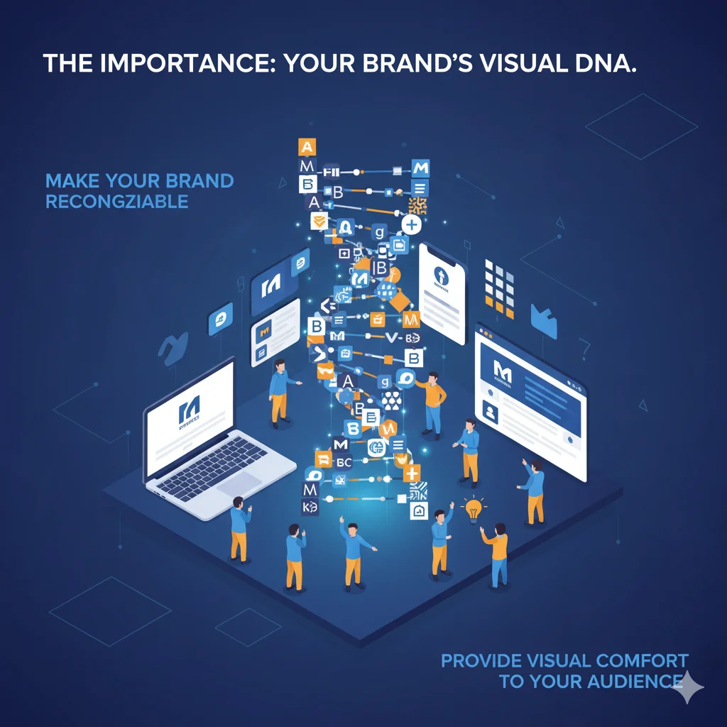
The Importance: Your Brand’s Visual DNA
Imagine if every time someone saw you, you had a different face Haunted, right? Inconsistent design is just the same. Your design language is a brand DNA filled with colors, fonts, and layouts that makes you unique and recognizable. branding guide
In Jeevan Tech creative branding service– we build trust, familiarity, and recognition. It tells your audience your brand is reliable, professional, and present every time they see it.
Why does it matter?
- Build trust and familiarity
- Make your brand recognizable
- Provides visual comfort to your audience
Funny truth: Your design should say “Hey, it’s me again!” and not “Surprise! Guess who?”
Brand’s Visual DNA
The Types: The Squad of Consistency
Consider your design language to be a sort of “team”, where each element plays its role, and then they all work together, nothing feels more polished and put together than everything working in harmony.
Here’s how we at Jeevan Tech keep your visuals cohesive and captivating:
1. Color Consistency:
When applying the same color palette across everything, your brand is recognizable in a different way ,like a signature scent that people will remember.
2. Typography Consistency:
Fonts are your brand’s personality. If the fonts are always changing with your audience, it’s like having a conversation with your audience where your personality is always changing mid-conversation,confusing, unsettling, and unclear. The same typefaces help you let the audience know the quality and professionalism of your brand.
3. Layout Consistency:
The way in which elements are organized on your website, and post opens, and ads is the uniform layout style you use. Consistent layout styles help facilitate reading the content presented. If everything has a different layout, your audience may feel lost and not even get through reading the content.
4. Imagery Consistency:
Photographs, illustrations or icons should convey a consistent style and tone within the overall imagery style. Random images combined with a mismatched style will make sections of your brand feel completely disconnected and will visually scatter the reader’s perception of the brand into pieces.
Effect of all together
When color ,font, layouts and imagery are aligned ,your brand feels professional. Instead of looking messy,it communicates clarity. The Graphics Standards for IES Publications and Collateral Materials
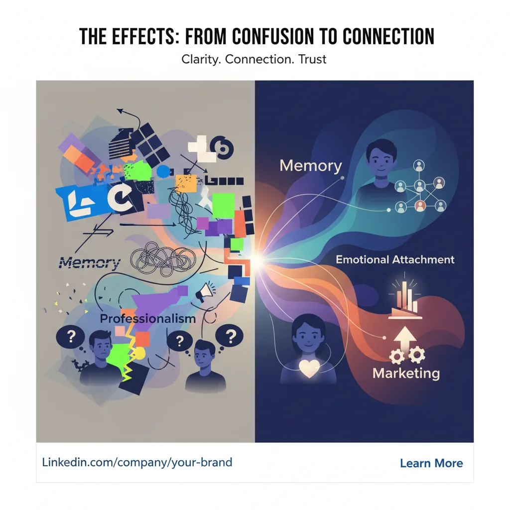
The Effects: From Confusion to Connection
When your colors, fonts, layouts, and imagery are aligned, your brand feels trustworthy and intentional.
Here’s what happens when Jeevan Tech’s leading design strategy takes over:
- Memory
If your colors, fonts, layout are consistent, your brand will often be
recognized beforehand,before they even see your name or logo. Repetition helps
enhance memory.
- Emotional attachment
Leaving a design consistent will give familiarity to your audience. Moreover,
familiarity is comforting. Similar to a favorite song that you listen to across different
occasions, your brand will become something that your audience can enjoy and be
confident in.
- Professionalism
Consistency suggests that the brand is organized, thoughtful, and even trustworthy.
Whereas different fonts and colors can make amazing content look amateur.
- Marketing
When every single post, ad, or newsletter looks and feels the same, people feels
connected . For your audience, it feels like they’re experiencing your brand like a show ,
they know what to expect, they enjoy it, and it becomes memorable.
Confusion to Connection
The Reality Check: Design Chaos Is Expensive
When the visuals of your brand don’t follow a consistent visual system, it creates problems for not only the way you look, but lowers the functionality of your brand and can even hurt your business.
Here’s what happens without a clear design language:
1. Loss of brand recognition:
If your colors, fonts and layouts change frequently, it will be hard for people to recognize your brand. If you don’t have consistency in your visual identity, your audience may forget you, or worse, confuse you for another brand.
2. Confused audience:
When your material is inconsistent, your brand appears unpredictable and careless. Your audience may feel at a loss or even frustrated while trying to figure out if they are still engaging with your brand.
3. Duplicate design effort:
If you don’t have a design system or style guide, every time you work on a new project , it will require extra work to determine colors, fonts and layouts. This can lead to lost time, increased spending, and slow your time to market.
As a best creative design service provider at coimbatore– Jeevan Tech eliminates this chaos by creating customized brand style guides and visual systems. These help your marketing team stay consistent, efficient, and aligned.
Conclusion:
At Coimbatore’s best Creative branding– Jeevan Tech is more than just a bunch of pretty designs.It is a strategic asset to build recognition, trust, and emotional affinity. When you employ a consistent design language, every color, font, layout, and image works together to create your brand’s visual DNA for your audience to identify and remember you.
Consistency will turn style into strategy, chaos into clarity, and one-off design into a branded experience. In short , when your creative branding speaks the same visual language at every touchpoint, your brand is not only noticed .It is remembered, trusted, and adored.
FAQs
1.Why is consistent design important in creative branding?
Consistent design helps your colors, fonts, layouts, and imagery work together across all channels, providing immediate recognition and trust of your brand.
2. How does consistent design enhance brand recall?
Repeating visual elements trains your audiences’ memory, making it possible for them to recognize your brand and recall even before the name or logo has been read.
3. What are the primary elements of a consistent design language?
Color palette, typography, layout, and imagery are the key elements that must be consistent to successfully create a cohesive brand identity.
4. Does creativity allow for consistency?
The definition of consistency in design is not to stifle creativity, but to creatively channel it. Creative branding keeps the visual elements aligned for recognition, while using design elements to stylize the brand in a thoughtful way.
5. What are the consequences of inconsistent branding visuals?
Inconsistent branding visuals will create confusion for audiences, decrease brand recognition, and result in additional design work and time, diminishing design worth and credibility.